How to Add Additional Custom Breakpoints in Elementor?
Are you ready to add additional custom breakpoints in ELementor Pro\free?
Recently, Elementor for WordPress introduced additional breakpoints, expanding from three to seven, offering more flexibility in designing for various devices.
In this comprehensive guide, we’ll cover how to activate, edit, and add breakpoints to your site, along with understanding how styles cascade within Elementor.
Table of Contents
Activating Additional Breakpoints in Elementor
Checking and Enabling Breakpoints: To begin, ensure that your Elementor settings have the new breakpoints feature activated.
Step 1: Navigate to Elementor > Settings > Experiments,
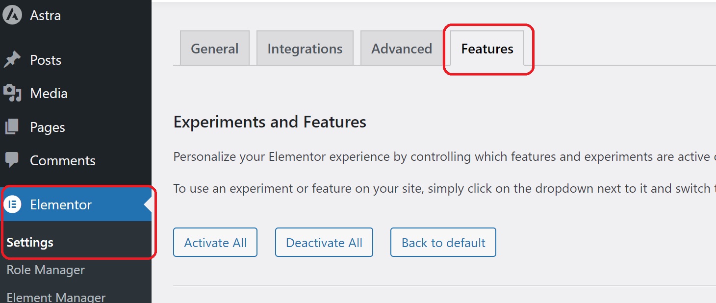
Step 2: Make sure the “Additional Custom Breakpoints” toggle is set to active. This step is crucial for unlocking the enhanced responsiveness options.
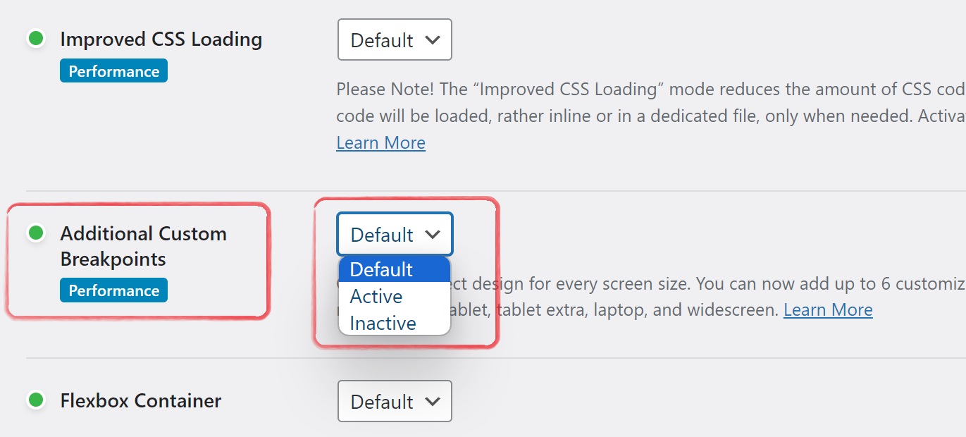
Step 3: Last click on save settings.
Verifying Activation on Your Site: After enabling the feature, save your settings. Confirm that the additional breakpoints are now available on your website by going to an individual page and entering the Elementor editor.
Add Elementor Breakpoints in the Editor
Understanding Responsive Mode:
In Elementor, you can preview and edit your content across various devices using the responsive mode icon. By default, you have three devices: desktop, tablet, and mobile. Elementor adopts a desktop-first approach, with styles cascading downward based on the chosen device.
Cascading Styles
Learn how styles cascade within Elementor. When you make changes in the styling options for a particular device, those changes cascade down to smaller devices. This understanding is crucial for effective responsive design.
Adding and Managing More Breakpoints
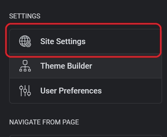
Step 1: After opening Elementor Editor, Click on top three line.
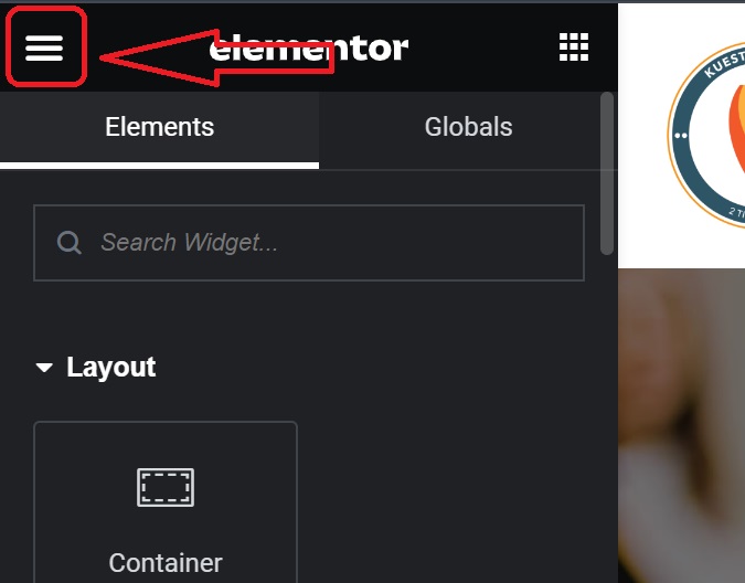
Step 2: Now click on Site Settings
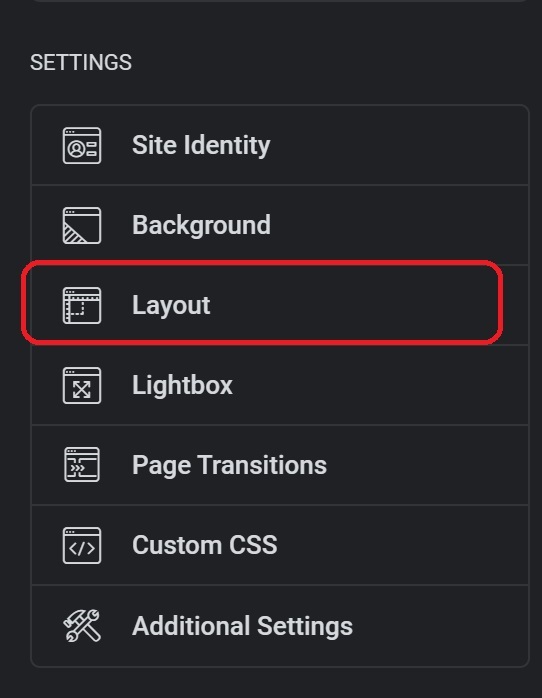
Step 3: Scroll down, Click on Layout
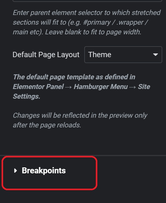
Step 4: Under layout, Just click on Breakpoints.
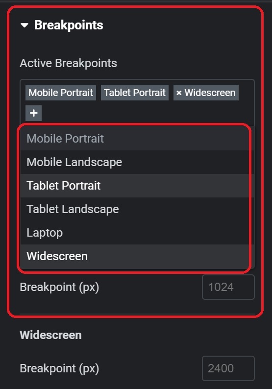
Step 5: Adding Breakpoints Click the plus icon to add breakpoints. Mobile Extra, Tablet Extra, Laptop, and Widescreen are among the options available. Each breakpoint has a predefined pixel width, making it easy for you to choose the right breakpoints for your design.
Step 6: Updating and Applying Changes Once you’ve added new breakpoints, hit update to apply the changes. Elementor may prompt a reload; proceed with it to see the updated editor.
Step 7: Styling for Different Devices In the responsive mode, you’ll now have access to seven devices. Styles applied to desktop will cascade down to smaller devices, while the widescreen breakpoint allows you to make specific changes for larger screens.

Conclusion: Add Additional Custom Breakpoints in Elementor
Congratulations! You’ve mastered Elementor breakpoints, unlocking a new level of control over your website’s responsiveness. Feel free to experiment with the various breakpoints and create a seamless user experience across devices. If you found this guide helpful, please share on social media.
Frequently Asked Questions
How do I add an extra breakpoint in Elementor?
Go to Elementor Settings → Site Settings.
Click Breakpoints and you’ll see the default ones.
Click Add Custom Breakpoint, input your desired screen size, and save.
How do I add a custom screen size in Elementor?
Navigate to Elementor Settings → Site Settings.
Under Breakpoints, you can add or edit existing breakpoints by inputting custom pixel values
How do I add custom code to WordPress Elementor?
From the WordPress dashboard, go to Appearance → Theme Editor.
You can add custom code directly into your theme’s header.php or footer.php file.
For specific page or section custom code, use Elementor’s Custom Code feature under Site Settings.
How do I add a new section to a page in Elementor?
In the Elementor editor, click the + icon to add a new section.
Choose the structure (e.g., one column, two columns).
Drag widgets into the section to build your content.


