Multilevel Menu Design Best Practices

Did you find a multilevel menu design that makes a good multilevel navigation menu for websites?
Multilevel Menu Design involves strategically structuring navigation menus on websites at multiple hierarchy levels. It aims to enhance user findability and streamline navigation by organizing content into clear main and subcategories.
In this article, multilevel menu design best practices guide you through the maze to enhance user experience, boost findability, and ultimately, ensure your visitors effortlessly discover the treasures within your digital realm.
Download Mega Menu Elementor Templates
Key Principles to Design a Multilevel Menu
Multilevel Menu Design refers to the strategic structuring of navigation menus on websites or applications with multiple levels of hierarchy.
It involves organizing content into a clear and intuitive menu system, typically with main categories and subcategories, to enhance user findability, streamline navigation, and make it Elementor Pro.

Create a Mega Menu design approach aims to improve the overall user experience by hierarchically presenting information, accommodating complex information architectures, and facilitating efficient exploration of digital content.
- Simplicity is Key: Keep things straightforward by limiting submenus to two levels. This prevents user confusion and streamlines the navigation process.
- Visual Cues Matter: Guide users with clear icons indicating the presence of submenus. A small arrow or triangle goes a long way in setting user expectations.
- Organize Intuitively: Align the hierarchy of information with users’ mental models. Consider their expectations, whether organizing products by brand or item type on an e-commerce site.
- Always Show the Way: Users should never feel lost. Highlight the current page in the menu, ensuring clarity on both main and submenu levels.
- Clear Copy Rules: In the world of menus, simplicity triumphs over clever wordplay. Keep link labels straightforward and descriptive to provide a strong information scent.
- Readability is King: Prioritize readability using a simple sans-serif typeface, adequate spacing, and an opaque background to avoid clutter.
- Accessibility Matters: Make clicking and tapping accessible, adhering to guidelines such as Google’s Material Design, with clickable elements at least 48 x 48 pixels in size.
How to Create a Mega Menu in WordPress with Elementor Pro
Desktop-Friendly Design Tips for Multilevel Menu
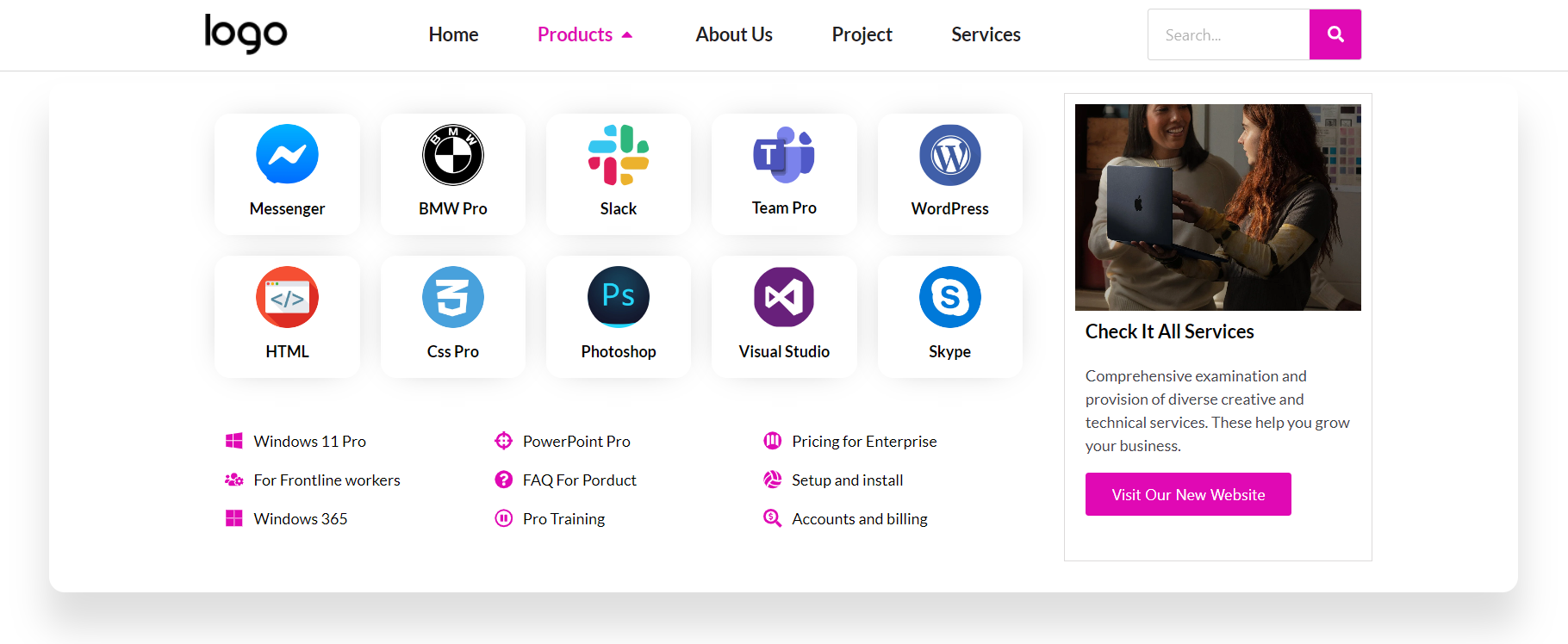
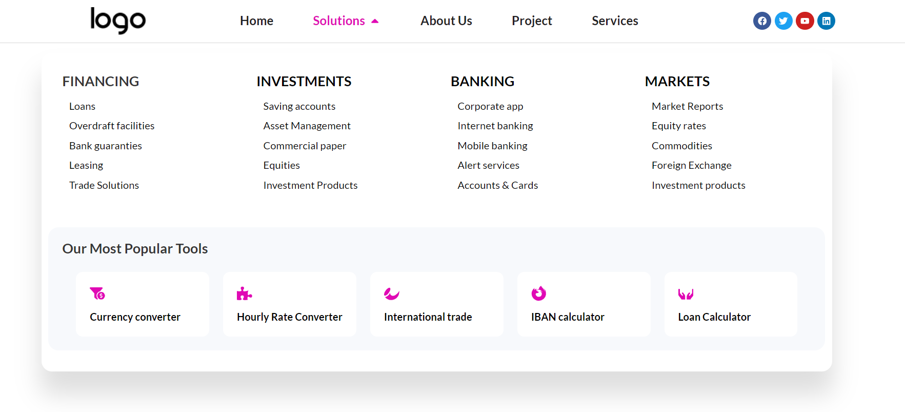
Desktop-Friendly Design Tips emphasize optimizing user experience on larger screens. Choosing click-to-open menus ensures reliability and avoids hover-related problems. Decide between drop-down or mega menus based on content volume; mega menus are suitable for extensive content.

- Click-to-Open Magic: Opt for click-to-open menus for consistent functionality and avoid hover-related issues on various devices.
- Drop-down vs. Mega Menus: Decide between a standard drop-down or a mega menu based on content volume, with mega menus offering space for images and descriptions.
- Hover States and Closure: Clearly show hover states for clickable elements. Close submenus intelligently, ensuring an intuitive desktop experience.
- Keyboard Navigation: Cater to keyboard users with distinct focused states for all links.
Make it a Multilevel Menu for Mobile Screens
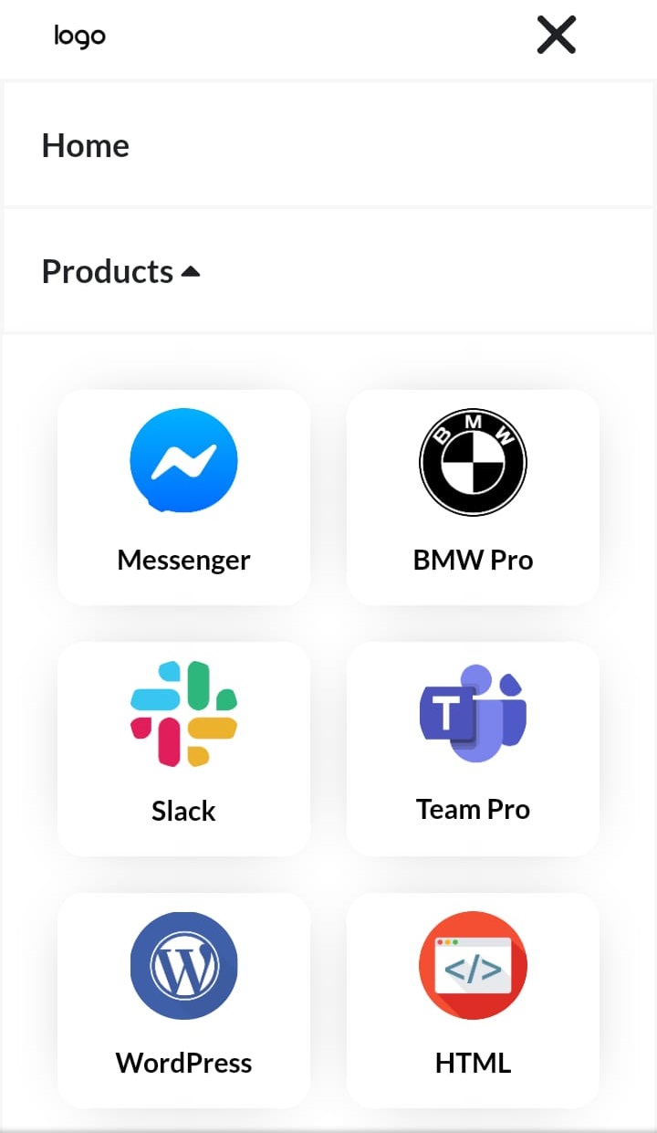
These strategies tailor the user experience for mobile screens, simplifying navigation and ensuring a seamless journey on smaller devices.

- Simplify the Main Menu: Given the limited real estate on mobile screens, simplify the main menu. Surface essential links for improved findability.
- Menu Trigger Magic: Introduce a recognizable menu trigger, like the ubiquitous hamburger icon, ensuring users can easily access hidden menu options.
- Sidebar Brilliance: Experiment with different mobile menu designs – full-width, bottom drawer, or circular corner. A sidebar with a dark, translucent background can provide a distraction-free experience.
- Effortless Closure: Allow users to close the menu easily through intuitive taps outside or by adding a visible closure option.
- Smart Sections and Overlapping Menus: Utilize expanding sections for single submenus. Consider overlapping menus for a cleaner layout on smaller screens, and add a “Back” link for navigation ease.
- Pre-Open Submenus: Enhance user understanding by automatically opening the submenus when users tap to open the main menu, providing context.
Conclusions
In conclusion, integrating “Multilevel Menu Design Best Practices” is crucial for cultivating a user-friendly and efficient digital experience. Adhering to principles like simplicity, visual clarity, and intuitive organization enhances navigation, boosts findability, and ultimately elevates user satisfaction. Whether tailoring menus for desktops or optimizing for mobile screens, these practices contribute to a seamless journey through complex information architecture.
As a next step, consider enhancing your design process by downloading Mc Starter Mega Menu templates, which can further streamline the implementation of these best practices and enrich the overall user experience on your website. Embracing these design principles, coupled with practical tools, ensures that users effortlessly navigate through digital landscapes, making your website a user-friendly destination.
What is Multilevel Menu Design?
Multilevel Menu Design involves strategically structuring navigation menus on websites at multiple hierarchy levels. It aims to enhance user findability and streamline navigation by organizing content into clear main and subcategories.
What is the difference between drop-down and mega menus?
Drop-down menus are suitable for fewer links, typically up to eight, while mega menus are wider and accommodate more content, often seen on large e-commerce sites. Mega menus can include images, headlines, and descriptions for enhanced user engagement.
What is a multilevel dropdown menu?
Multilevel dropdown menus are a web design staple to make the navigation bars more organized by providing dropdown options.


