5 Best Health & Wellness Website Examples 2026
Your health or wellness website has one job before anything else: earn trust in under five seconds. These 5 real websites are doing it brilliantly in 2026 — and every one of them has a design lesson you can steal for your own project.
In 2026, the health and wellness industry is one of the most competitive spaces online. Patients, clients, and customers are comparing multiple websites before making a decision — and they make that decision based largely on design, speed, and clarity. A poorly designed health website doesn’t just look bad; it costs you appointments, leads, and revenue.
In this post, we break down 5 real health and wellness websites that are setting the bar in 2026 — explaining exactly what they do well and what design principles you can apply to your own site. Whether you’re building with WordPress, Elementor, or any other platform, these examples will give you a clear direction.
1. Center for Vein Restoration
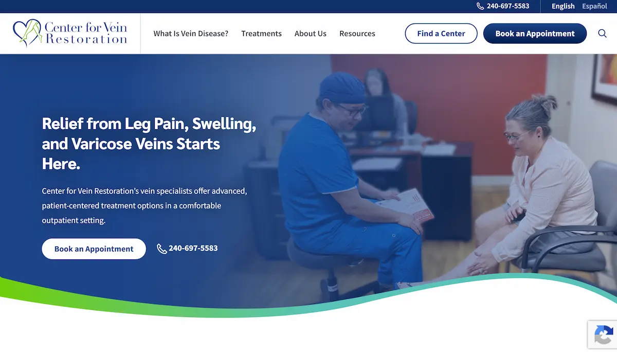
Center for Vein Restoration leads with empathy before it leads with information — and that’s exactly the right order for a medical website. Their deep navy hero section, soft gradient overlay on the patient consultation photo, and the headline “Relief from Leg Pain, Swelling, and Varicose Veins Starts Here” communicate warmth and competence at the same time.
Notice the dual CTA strategy above the fold: a dark “Book an Appointment” button for action-ready visitors, and a phone number with icon for those who prefer to call. This two-path approach is critical for medical sites where patient comfort levels vary enormously. Nothing is buried, nothing requires scrolling to find.
The subtle wave-shaped section divider separating the hero from the content below is a sophisticated visual detail — it makes the page feel modern and polished without relying on heavy imagery or complex animation. The five-item navigation is minimal and task-oriented, not organized by internal department structure.
2. SkinnyRx
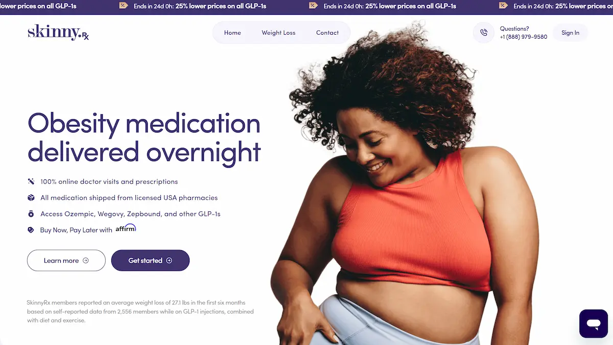
SkinnyRx is a case study in conversion-first design. Before a visitor even reads the headline, a purple announcement bar at the very top of the page has already created urgency: “Ends in 24d 0h: 25% lower prices on all GLP-1s.” A countdown-style offer in a persistent bar is one of the highest-impact conversion tools available — and it costs nothing to implement in WordPress.
The main headline is brutally direct: “Obesity medication delivered overnight.” No softening, no jargon, no fluff. The four bullet points underneath (online doctor visits, licensed pharmacies, GLP-1 access, BNPL via Affirm) address the four most common objections a visitor might have in one clean scan — taking less than 10 seconds to read.
The photography choice is equally deliberate. Rather than clinical imagery or “before/after” comparisons, SkinnyRx chose a smiling, confident woman looking downward — communicating self-acceptance and empowerment. This positions the brand as supportive rather than judgmental, which is essential for a sensitive health category like weight loss.
3. HairQare
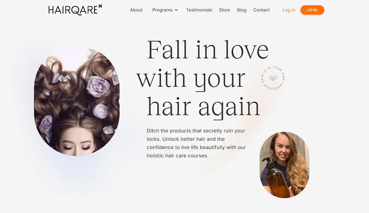
HairQare is the most visually distinctive example on this list. Where most wellness brands follow predictable design playbooks, HairQare leans into a soft editorial aesthetic — oversized serif headline (“Fall in love with your hair again”), an off-white neutral background, a rounded oval portrait image, and hand-crafted-feeling accents like a circular wax-seal badge that reads “Hair is in your own hands.”
This kind of design signals intentionality. It tells the visitor: this isn’t a mass-market product site. This is a thoughtful brand that cares about how it presents itself — which, by extension, suggests it cares about how it delivers its service. The founder photo in the bottom-right corner adds credibility and a personal face to the brand, making the business feel human rather than corporate.
The single high-contrast orange “JOIN” button in the navigation is a perfect example of color used strategically. The entire page palette is neutral and soft — which makes that one orange element impossible to miss. Your eye goes straight to it. Clean, elegant, and highly effective.
4. IVIM Health
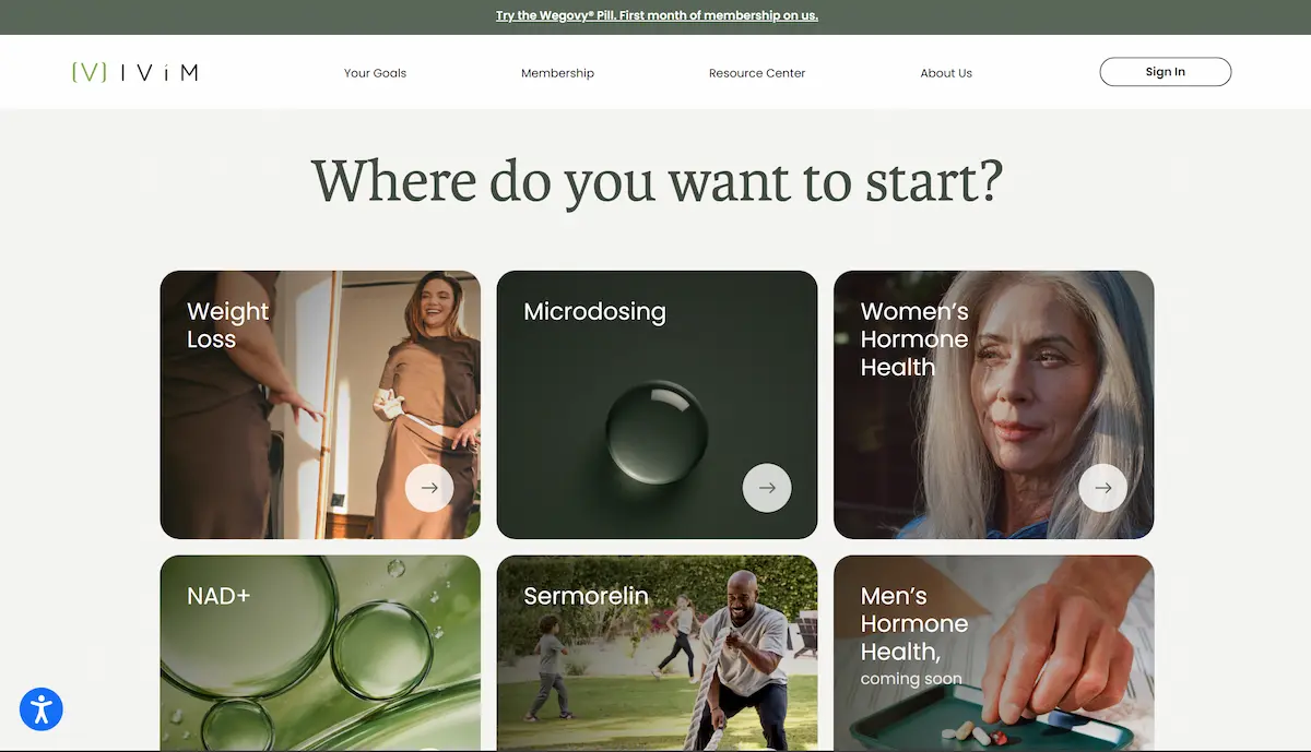
IVIM Health throws out the traditional hero-headline-CTA formula entirely — and it works brilliantly. The homepage leads with a single bold question: “Where do you want to start?” followed immediately by a 3×2 grid of goal-based service cards: Weight Loss, Microdosing, Women’s Hormone Health, NAD+, Sermorelin, and Men’s Hormone Health.
This is textbook task-oriented UX design. Instead of making visitors read through service descriptions and figure out which one applies to them, IVIM routes them instantly based on their personal health goal. Each card is a rich photo paired with a clean label and a circular arrow — inviting a click, not demanding it. The result feels less like a clinic website and more like a concierge wellness platform.
The color palette — warm sage green, deep forest tones, and off-white — signals premium and natural without being clinical. Combined with editorial photography across every card, IVIM positions itself firmly in the upscale end of the health market. The accessibility icon in the bottom-left corner is a small but important trust signal — compliance-conscious design matters for health platforms.
5. Lindywell
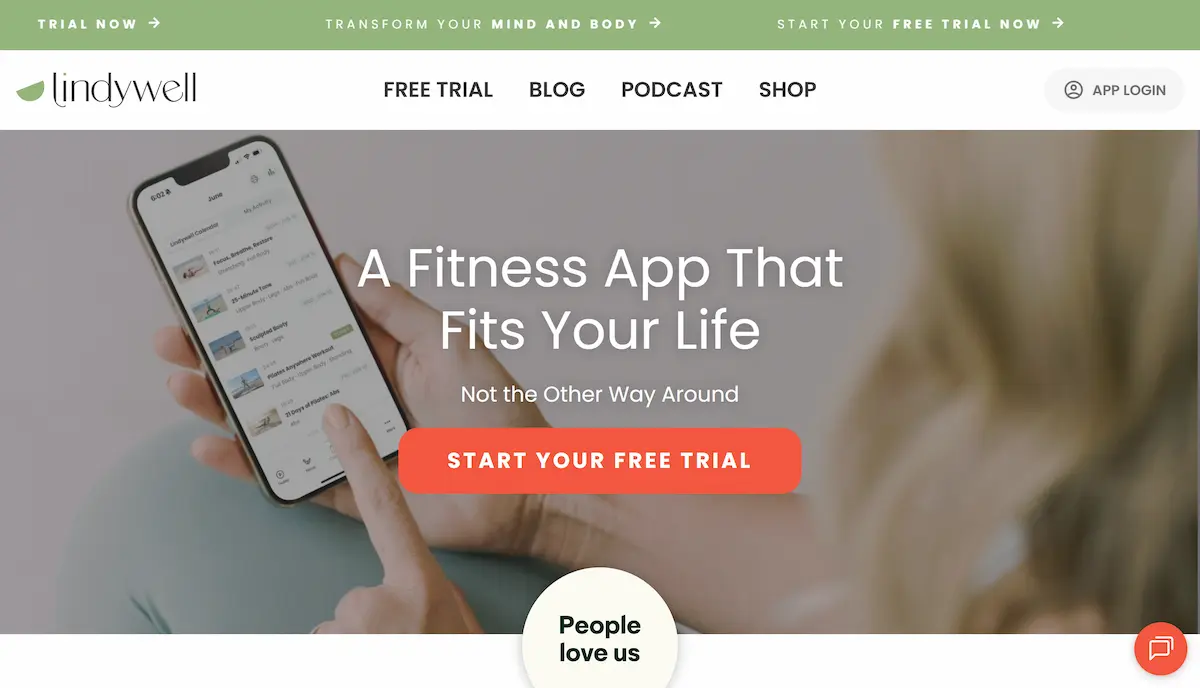
Lindywell grabs your attention before you even reach the hero. Three scrolling announcement bars fill the top of the screen — “TRIAL NOW,” “TRANSFORM YOUR MIND AND BODY,” “START YOUR FREE TRIAL NOW” — creating instant energy and pace. This triple-bar pattern is unusual and memorable; it signals an active, community-driven brand with something to offer right now.
The hero image is a product-in-hand shot — a woman’s hands holding a smartphone with the Lindywell app calendar visible on screen. This is one of the most effective techniques for app-based wellness platforms: show the actual product experience before you describe it. The headline follows: “A Fitness App That Fits Your Life. Not the Other Way Around.” This line directly names the core frustration users feel with rigid fitness programs and immediately positions Lindywell as the solution.
A large, coral-orange CTA button (“START YOUR FREE TRIAL”) sits centered in the hero. Its color was chosen specifically to contrast against the muted tones of the lifestyle photo — making it unmissable. Just below the fold, a “People love us” social proof badge is placed precisely where a hesitant visitor is deciding whether to click — removing the last psychological barrier at the exact right moment.
Key Design Lessons to Apply to Your Health Website
These five examples cover different health niches — from medical clinics to fitness apps — but they share the same core design DNA. Here is what they all get right, and what you should prioritize when building or redesigning your own health or wellness website.
It’s worth noting that good health website design sits at the intersection of visual design and user experience design — the goal is never just to look good, but to reduce friction between a visitor and the action you want them to take.
One Dominant CTA Per Screen
Every strong example uses one primary call-to-action above the fold. Don’t give visitors five options — give them one clear next step.
Real, Empathetic Photography
Generic stock images don’t build trust in the health space. Use real people, real product shots, or imagery that reflects your actual client’s experience.
Headlines That Speak to Pain
The best health headlines address a fear or desire, not a feature list. “Starts here,” “fits your life” — these speak to a feeling, not a specification.
Social Proof Near Your CTA
Star ratings, review counts, and trust badges placed close to the main CTA remove hesitation exactly when the visitor is deciding whether to act.
Mobile-First Performance
Health queries happen on phones. If your site isn’t fast and fully readable on mobile, you’re losing patients before they ever read your content.
Restrained, Purposeful Color
One primary brand color, one accent for CTAs, and a neutral background. Cluttered palettes on health sites destroy the trust you’re trying to build.
How to Build a Health & Wellness Website in WordPress
Inspired by these examples? WordPress is one of the most practical platforms for building professional health and wellness websites — and you don’t need to start from scratch. The right template foundation saves weeks of design work while giving you full flexibility to customize your layout, branding, and content.
If you’re just getting started, choosing the right theme is the single most important decision. Our guide to the best WordPress themes covers the top options for 2026 across every niche, including health, coaching, and service-based businesses. Once your theme is in place, a well-designed header sets the tone for the entire site — see our best WordPress header templates for ready-to-use options that match the clean, professional look of the examples above.
If you want to get your content strategy right from the start, our breakdown of the best Elementor blog templates includes layouts perfectly suited for health-focused blogs — including those covering treatments, wellness tips, and client success stories.
Building a health website that ranks on Google and converts visitors into patients requires more than good design — it requires the right structure, fast load times, on-page SEO, and clear user journeys from the very first click. These are exactly the principles behind every one of the five examples we’ve covered in this post.
Final Thoughts
The best health and wellness websites of 2026 have moved well beyond generic templates and stock-photo-heavy layouts. The five examples in this post — Center for Vein Restoration, SkinnyRx, HairQare, IVIM Health, and Lindywell — each demonstrate a clear design philosophy: put the user’s goal first, remove every barrier between arrival and action, and build trust through consistency, clarity, and visual honesty.
Whether you’re designing a medical clinic website, a wellness coaching platform, a health app, or a direct-to-consumer health brand, these principles apply. Start with empathy, design for clarity, and let your visual choices do the trust-building work that paragraphs of text can never fully achieve.