
- 80% off on all Templates
Elementor Mega Menu Templates Bundle

Browse Our Elementor Mega Menu Templates Bundle

15 Mega Menu Templates
- The sale will end soon.
27
One Time Payment
Just 4 steps
Stop building websites from scratch. Save time with our easy Elementor templates. Just download the templates, import it with one click, and you’re done.
1. Choose a Template
Browse 300+ templates across categories. Filter by builder, type, or niche.
02. Download
Instant download after secure checkout. Includes all source files & assets.
03. Import to WordPress
One-click import via Elementor or Divi. No coding required.
04. Customize & Launch
Swap colors, fonts, content — and go live. It’s that simple.
Loved by Freelancers & Agencies Worldwide
Trusted by freelancers, agencies & developers in 100+ countries
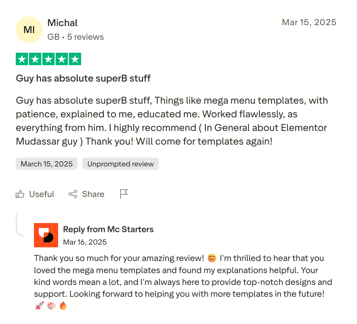
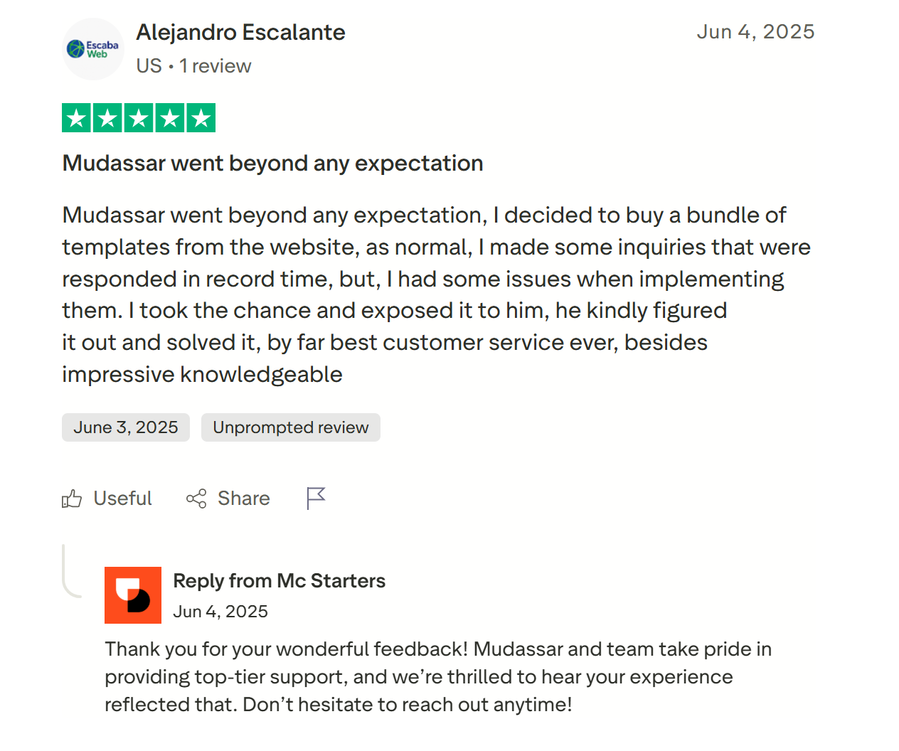
Get Free Support
Find quick answers to all your questions about using our templates. Explore our full range of services designed to support your goals. Let our team help you find the perfect solution.
Most Frequently Asked Questions
Do I need Elementor Pro to use these templates?
Yes. These templates use Elementor Pro’s Theme Builder and Menu widget to power the mega menu’s dropdown functionality. The free version of Elementor does not include this feature.
Will I need a separate mega menu plugin?
No. Every Mc Starters mega menu template is built using Elementor Pro’s native widgets, so you don’t need to install ElementsKit, Max Mega Menu, or any other third-party plugin.
Do we need a third party plugin to create a mega menu in Elementor?
With latest Elementor pro version no need to third party plugin for create mega menu in elementor pro. You can just need to install elementor pro and download Mc Starters templates.
More Content
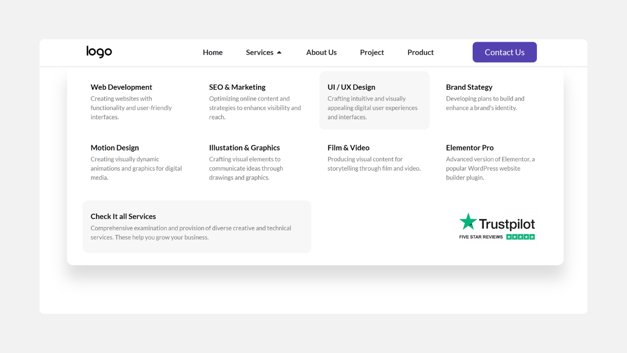
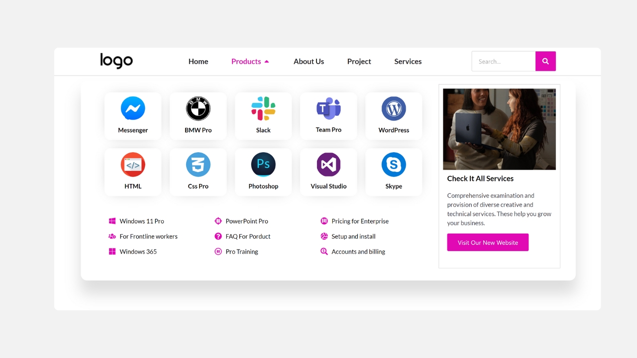
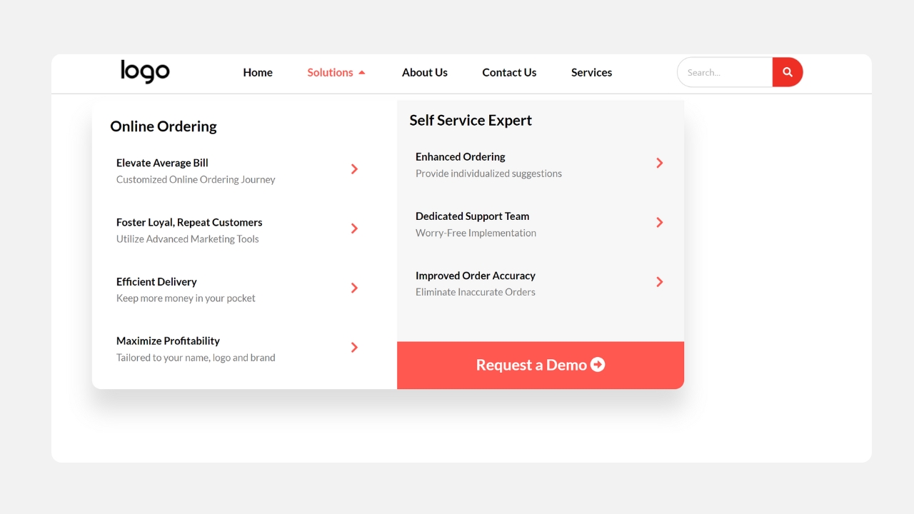
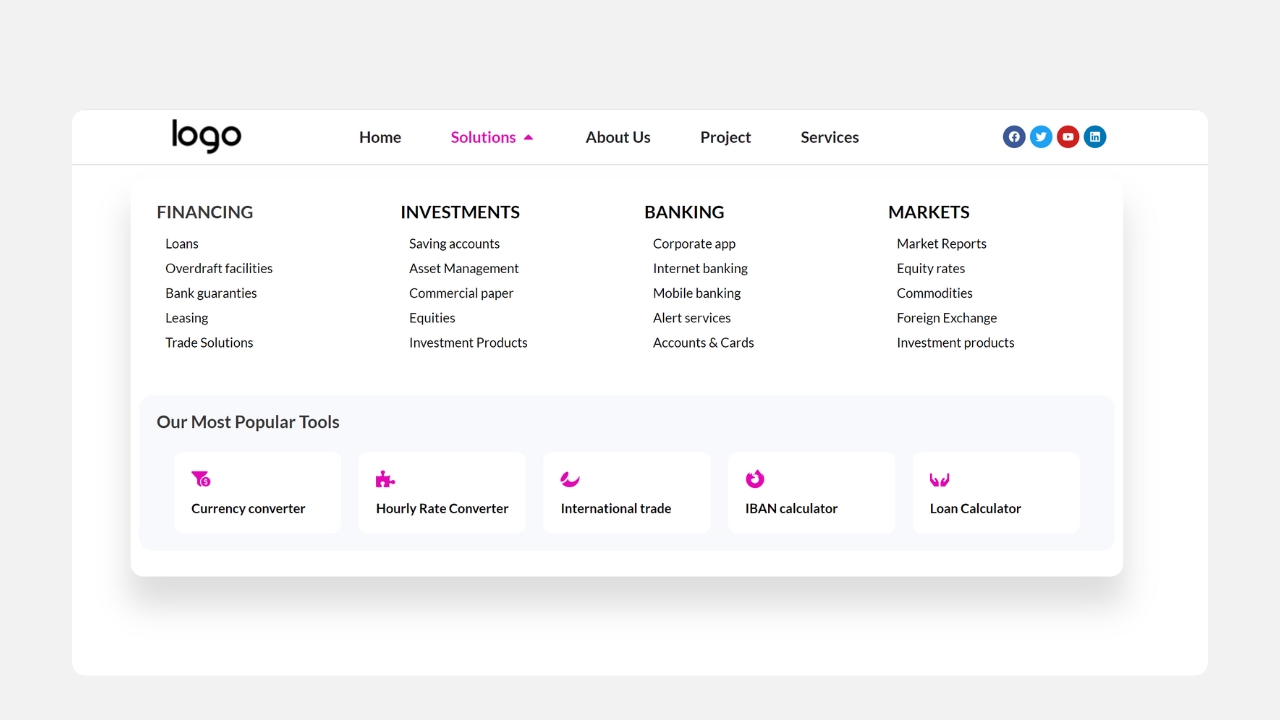
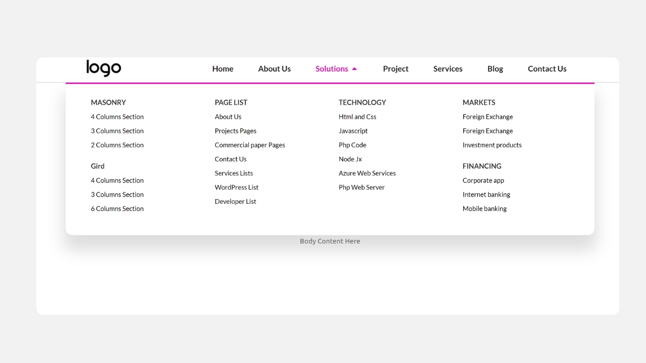
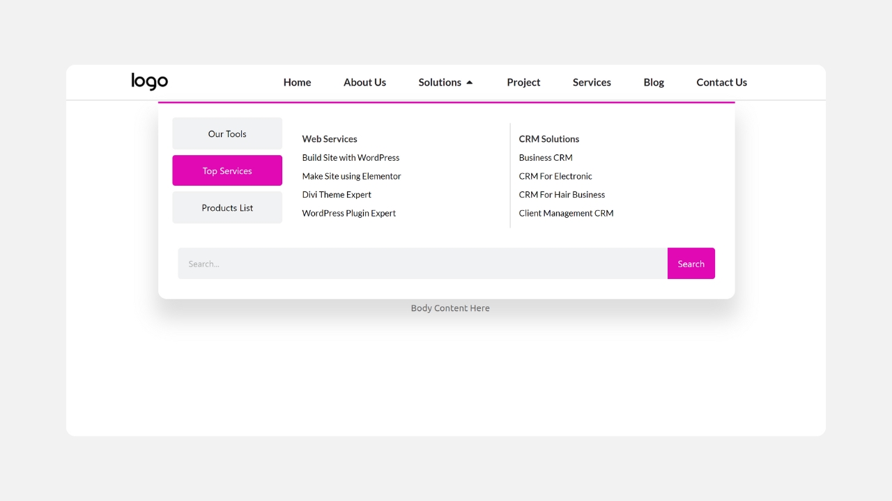
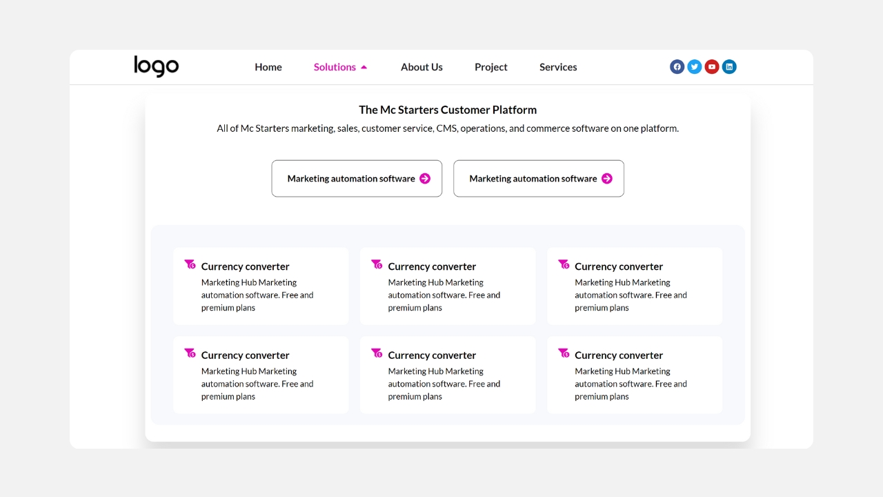
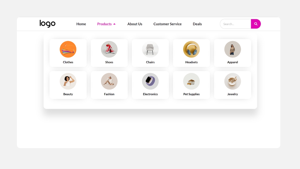
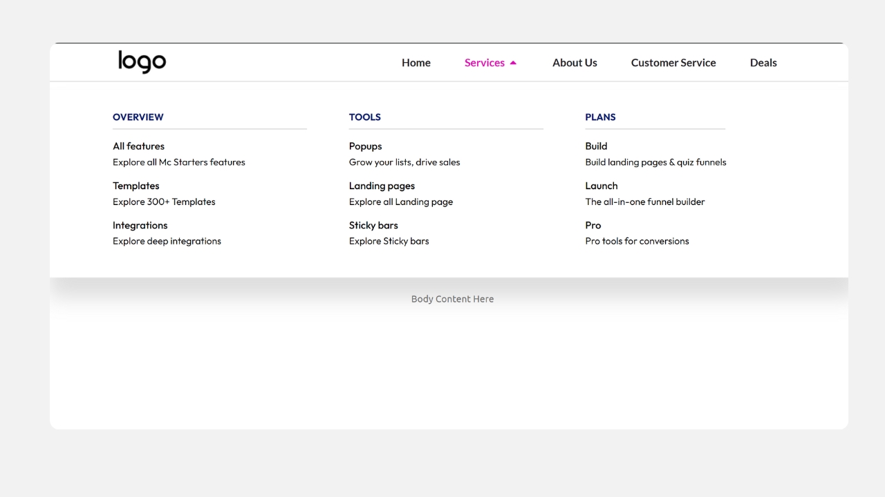
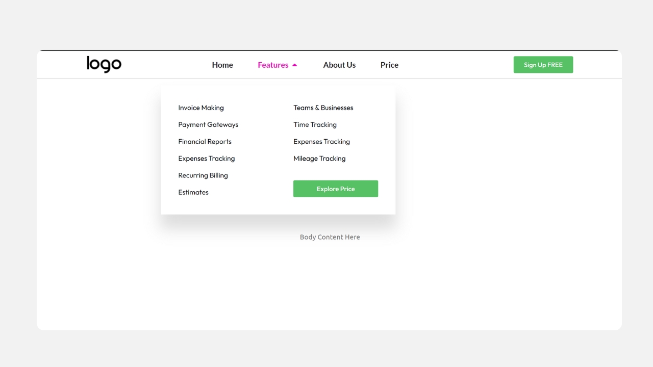
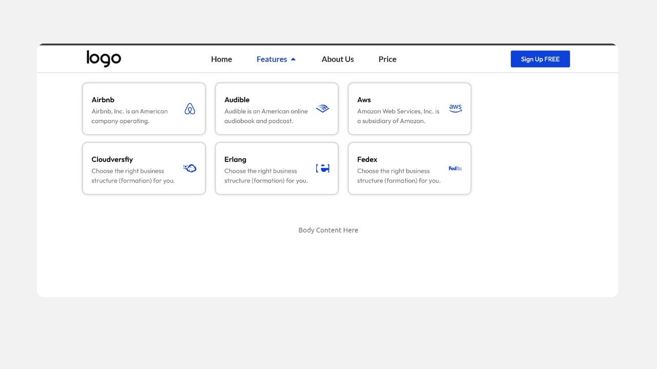
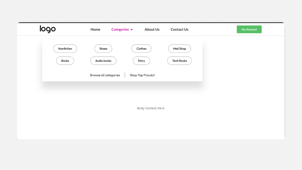
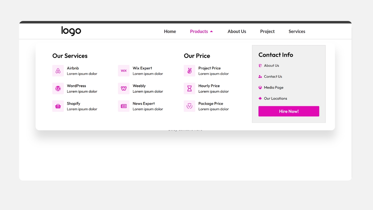
Elementor Mega Menu Templates
Build a fully responsive, professional mega menu on your Elementor website in minutes — no coding, no guesswork. Whether you run an ecommerce store, an agency site, or a content-heavy blog, McStarters’ Elementor mega menu templates give you a polished, mobile-friendly navigation menu that’s ready to import with one click and customize to match your brand.
Why Use a Pre-Built Elementor Mega Menu Template?
A mega menu is one of the highest-impact navigation upgrades you can make to a growing website — it organizes large amounts of content into clear categories, reduces bounce rate, and helps visitors find what they need faster. But building one from scratch inside Elementor means designing columns, spacing, hover states, and mobile behavior all by hand, which can easily take several hours per header.
Our templates remove that work entirely. Each one is pre-built, tested across devices, and structured so you only need to swap in your own links, images, and brand colors.
Fast Setup
Import in one click through Elementor’s Theme Builder — no need to design columns or breakpoints from zero.
Fully Responsive
Every template is tested on desktop, tablet, and mobile, with a clean collapsed menu for smaller screens.
Easy to Customize
Change colors, fonts, icons, and images directly inside Elementor — no custom code required.
No Extra Plugin Needed
Built using Elementor Pro’s native Menu widget, so you avoid the added weight and conflict risk of a third-party mega menu plugin.
Templates vs. Plugins vs. Building From Scratch
| Approach | Setup Time | Design Skill Needed | Extra Plugin? | Best For |
|---|---|---|---|---|
| McStarters Templates | Minutes | None | No | Anyone who wants a polished result fast |
| Mega menu plugin (e.g. ElementsKit, Max Mega Menu) | Hours | Low–Medium | Yes | Sites needing very custom hover/animation controls |
| Building manually in Elementor Pro | Several hours | Medium–High | No | Developers who want full control over every detail |
How to Import an Elementor Mega Menu Template
- Make sure Elementor Pro is active. The mega menu functionality relies on Elementor Pro’s Theme Builder and Menu widget.
- Download your chosen template from the section above — you’ll receive a JSON file.
- Go to Templates → Saved Templates in your WordPress dashboard, click Import Templates, and upload the JSON file.
- Open Theme Builder → Header and insert the imported template into your existing header, or create a new header template with it.
- Replace the placeholder links, text, and images with your own categories and content.
- Preview on desktop and mobile to check spacing and the mobile collapse behavior before publishing.
- Publish your header and set the display conditions so it applies site-wide (or to the pages you choose).
Customizing Your Template
Every template is built with standard Elementor widgets, so customizing it works exactly like editing any other Elementor section:
- Colors: Update the color panel to match your brand’s primary and accent colors — this updates hover states and CTA buttons automatically if you use Global Colors.
- Fonts: Swap in your site’s font via Global Fonts so the menu matches the rest of your design.
- Columns: Add, remove, or resize columns depending on how many categories you need — most templates ship with 3–4 columns as a flexible starting point.
- Images/Icons: Replace placeholder icons with your own category icons or product thumbnails, keeping file sizes small for fast load times.
What You Need Before You Start
- WordPress installed and running
- Elementor (free) plugin installed
- Elementor Pro — required for Theme Builder and the Menu widget that powers the mega menu functionality
Ready to Skip the Setup Work?
Import a polished, ready-to-edit mega menu template and have your header done today.